How to Design Your Dream Space using Color Theory
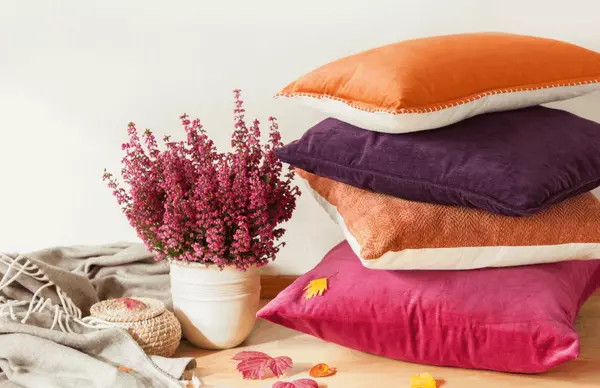
How to Design Your Dream Space Using Color Theory Color theory is an interior designer’s secret to selecting the best color combinations for a home, and it’s simpler than you might think. Implement this color theory hack when choosing paint color, furniture colors, and finishes to get the space of your dreams that best matches your aesthetic! But first- what is color theory?Color theory is the study of hues and how to use them in harmony, and how color can affect the mood and aesthetic of a space or object. In order to apply color theory in a design, an understanding of primary, secondary and tertiary colors as well as shade, tint, and tone, and how they interact with each other is a must. You’ll also need a color wheel to reference. Primary Colors: red, yellow, and blue Secondary Colors: green, orange, and purple Tertiary Colors: colors made from 1 primary color and 1 secondary color, i.e. blue-green Shade - a color to which black has been added Tint - a color to which white has been added Tone - a color to which both black and white have been added How to apply color theory in designSTEP ONE: Pick a Color TemperatureTake into consideration how you want to feel when you enter a room. The temperature of a room can invoke feelings of joy and passion, or relaxation and creativity. Warmer colors excite the brain while cooler colors tend to relax it. Traditionally, if you opt for a cool temperature, the colors you’ll use are blues, greens, and purples; whereas for a warm temperature, you’ll use reds, yellows, and oranges. Neutral is a temperature choice if you prefer being somewhere in between, whites and creams for relaxation, with blacks and browns for a little excitement. Neutral is a great option for those who want the relaxing vibe of a cool room, but also want the warmth of color. Often we see cool temperature designs in bathrooms and offices, warmer designs in living rooms, dining rooms, and children’s bedrooms, and neutral designs in kitchens and adult bedrooms. STEP TWO: Choose a Color SchemeNow that you know the temperature range of colors, it’s time to choose the specific colors. A good tactic for this step is to consider color combinations known as harmonies. Harmonies Monochrome: 3 shades/tints/tones of the same color for a cool and organized look Complementary: 2 colors that are opposites on the color wheel for a bold look Analogous: 3 colors side-by-side on the color wheel, for a colorful look without being too busy Triadic: 3 evenly spaced colors on the color wheel, for a vibrant look (1 dominant color, 2 accent colors) Tetradic: 4 colors evenly spaced on the color wheel, for an even more vibrant look (1 dominant color, 3 accent colors STEP THREE: Balance Your PaletteAbide by the 60/30/20 rule to determine how much of each color to use. Your dominant color will cover 60% of the room, a secondary hue takes up about 30%, and an accent color tops off the room at 10%. Use this rule when implementing color into every aspect of the design- wall paint, furniture, decor, wall art, and rugs. Also, make sure to take into consideration how the lighting in the space will affect the colors. If there is less natural light in the space, increase the pops of white. If the room is abundant with sunlight, increase the darker accents.

2023 Interior Design Predictions
Itching to redo your bedroom…but not sure how? We’ve got you covered.From vintage revival inspo to this year’s leading paint colors, interior design experts have compiled a list of what’s going to be hot in 2023. A R T I S A N SThe percentage of handmade goods designers will source from craftspeople is expected to rise, with wood and plaster likely to be the most popular materials. We can expect to see these materials used in everything from custom lighting to wallcoverings. S U S T A I N A B I L I T YEco-friendly interior design choices have gained momentum over the past few years and will continue to gain popularity in 2023. Designers will often use organic materials complimented with natural elements such as indoor water features, plants, and soothing neutrals. V I N T A G ESome vintage design choices are expected to make a comeback this year, including geometric forms, chintzes, and abundant mirrors from the 1980’s, as well as pastels, fruit motifs, and knotty pine-covered walls from the 1950’s. G R E E NGreen has been a dominating color in interior color palettes for a few years now, and that’s not expected to change this year. Emerald is expected to be the number one shade choice for wall paint as jewel tones continue to gain popularity. A R TDesigner’s are expected to incorporate more artwork into their spaces than in the past, with emphasis on the use of sculptures as center pieces and focal points. On walls, paintings will be used more, whereas drawings, prints, and photographs will be used less. source

7 Essential Renovations to Maximize Your Profit
Maximizing your return on investment begins with determining the estimated value of your house in today’s market. There are two free, quick, and easy ways to get this answer within the next 24 hours. Before you start tackling updates, additions, or renovations, take a look at our guide that outlines 7 essential renovations to maximize your profit.
Categories
Recent Posts


