Pantone Color of the Year 2022
Introducing Pantone’s selection for Color of the Year 2022: PANTONE 17-3938 VERY PERI “A New Pantone Color Whose Courageous Presence Encourages Personal Inventiveness and Creativity.” Pantone’s ability to forecast color trends is a marketing force that has influenced product development and purchasing decisions in multiple industries for the past 23 years. You can be sure to see Veri Peri used throughout the year by designers from all industries. Within the real estate industry, interior designers and home stagers incorporate the color into paint, fixtures, cabinets, and decor choices. Pantone experts arrive at a selection each year after searching the world for new color influences. This can include the entertainment industry, art, fashion, design, lifestyles, socio-economic conditions, technology, materials, textures, and effects that impact color. In 2021, Pantone chose Illuminating Yellow and Ultimate Gray as the Colors of the Year to highlight how different elements can come together to express an uplifting message of hopefulness, in response to the global pandemic in 2020. This year, Pantone took a similar approach, choosing Veri Peri to comment on these transformative times. Veri Peri, according to Pantone, is “a symbol of the global zeitgeist of the moment and the transition we are going through.” Pantone noted as we emerge from a period of isolation and further descend into a dynamic virtual world, we can create new color possibilities. Veri Peri derives from current trends in gaming and the expanding popularity of digital art. The color illustrates the fusion of modern life and the digital world. Source

Styling Your Home for Fall
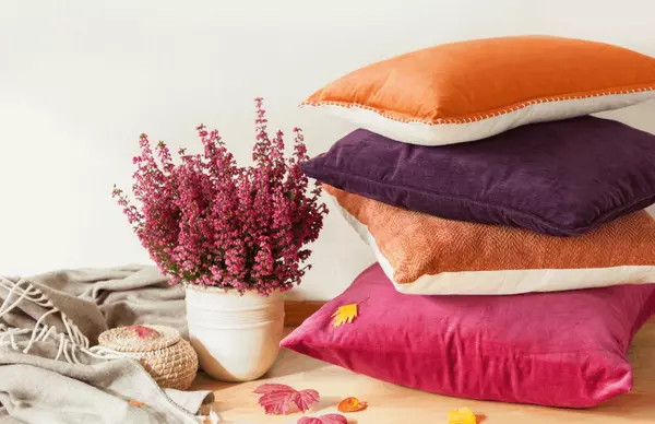
The leaves are starting to change, and while the magic is happening outside- it’s up to you to bring the prettiest season of the year indoors. Welcome fall, in all it’s glory by creating the coziest autumn space in your home with a few festive interior design choices. Follow these seasonal styling tips to fall-ify your home room by room: Foyer Create the warmest welcome with fresh or dried flowers in harvest colors, an autumn wreath on the front door, and a vintage throw runner underfoot. KitchenPlace ironstone dishes on open shelving in white, cream, and beige tones, and scatter in a few white pumpkins for display. Create a fall tablescape with a harvest centerpiece by placing gourds and pine cones around a vase filled with feathers and/or sheaves of wheat instead of traditional flowers. Add a basket or bowl of apples to your countertop to tie everything together. Dining RoomPlaid table trimmings, garland, napkins, and a festive table runner will instantly scream fall. You can’t go wrong with a classic red and blue plaid, but if that’s a little too much color for you, then opt for a neutral colored plaid. This will give your dining room table a more subtle fall feel. Living/Family RoomsAccessorize your coffee table and mantel with brass candlesticks, antlers, and dark shades of fall colored books. If you have a fireplace, keep it lit when you have company to heighten the ambience. Even if you don’t have a fireplace, setting out a few wood logs will help bring the space together. BedroomsAside from switching out linens to be fall colors, put out candles on the nightstand and dressers. To bump up the fall feels and in some fall scents like pumpkin spice and apple orchard. As for how they look, pick ones that are deep velvets, rich greens, or even jet black to change it up from the cliche fall colors. Throwing in one or two sleek gold candle holders will take the space to the next level. BathroomsA fresh bloom or two can brighten up your bathroom any time of the year. Try displaying bright orange or red mums (a favorite of our Professional Home Stagers for the fall season!) on your bathroom sink and shelves to instantly add a festive feel to the small space. As always, candles are a great multipurpose decor piece for bathrooms. Book NooksBook nooks don’t need much decorating for fall since they already express the cozy vibe. Switch out pillows and blankets with fall colored ones, like cinnamon and deep red. Accessorize with just one plaid pillow and the space will be transformed. Front PorchHang a fall wreath on your front door, and display pumpkins, hay stacks, and gourds throughout your porch by lining your front steps or front pathway. Tall sheaves of wheat look great when placed on both sides of your front door. HallwaysIf you want to go the extra mile this year, decorate your hallways too. Options include painting the walls fall colors or hanging a fall printed wallpaper on just one of the walls. For a less time consuming project, dress up a corner of the hallway with a tall vase of sheaths of wheat or cotton branches, and add a few display pumpkins around it. Source

How to Incorporate Color in a Small Space
When decorating small spaces, it can be tempting to play it safe with neutrals. It’s time to explore the rainbow and embrace color! Vibrant shades can work in bathrooms, book nooks, hallways etc. when done tastefully. Here are some inspiring ways to introduce more color into your homes’ small spaces. Monochromatic - One way to add a lot of color to a tiny room without overdoing it is by using multiple shades of the same color. For example, if you like the color blue, paint an accent wall a cool blue, then accessorize with a cobalt rug, turquoise lamps, and navy throw pillows. The shades will play together and add instant excitement to the tiny room. Balance the color with pops of a neutral color to not overwhelm the small space. Focus on Accessories - Because you’re working with a smaller space, sometimes colorful walls can overdo it. If this is the case, stick with neutral paint and instead, add in pops of color through accessories and fixtures. For example, add pops of green to your office with plants, a green desk or chair, green desk lamp, or green wall art. The green accessories will be eye-grabbing against a neutral wall. Try Two Tones - Sometimes to make color work in your space you need to balance it with another color. Two colors can complement each other bringing vibrant life to the tiny space, and can help separate the room into smaller, cozier sections. By doing this, you can even make your small space actually appear larger than it really is. Complimentary colors work great for this technique!Complimentary colors:-blue and orange-yellow and purple-green and redPairing a neutral, like gray or black, or pairing two warm colors or two cool colors can also work in a small space. Whatever suits your preference! Top or Bottom Wall Paint - When painting interior walls, rich and dark colors can overwhelm a small space, but this doesn’t make them unusable! These colors work great when you paint just the top or bottom portion of the wall. This will create balance and geometric interest in the tiny space. Use crown molding to separate the color from the non colorful part of the wall. This technique works great in hallways and bathrooms. Back Painted Shelving - Sometimes when it comes to color in your space, less is more. For example, you don’t want a ton of color in your home office because it may distract you from getting your work done. Try painting just the back of your shelving. The pop of color will be just enough to liven up a space without being too overpowering. Source
Categories
Recent Posts


